Goal
Let’s pretend…
The State of Hawaii is looking to update their aging infrastructure, particularly to help reduce their environmental impact. A potential solution is replacing cesspool systems in favor of sewage systems that are more efficient and reduce waste leakage. In this mock case study, I’m going to evaluate what major barriers might be present from population metrics.
What’s the Situation?*
Hawaii is a unique state, in large part because of it’s segmented geography. The archipelago is composed of 6 main islands (7 or even 8 depending on who you ask) divided into 5 counties. Ranging from the populous urban capital of Honolulu–so influential that the city claims its own self-named county composing the entire island of O’ahu–to the lava and farm fields of the Big Island, it is especially difficult to make equitable, uniform policy decisions across the state.
Recently, the government has been interested in updating waste water infrastructure. Not all of the islands have comprehensive sewage systems. Instead, some local communities rely instead on individual cesspools, in large part because replacing that decades-old infrastructure would be expensive. To that extent, cesspools are used more often in poorer communities. However, sewage systems have lower long-term maintenance costs and are less prone to environmental damages (e.g. leakages).
Knowing that replacing cesspools require both the literal and metaphorical buy-in of the households currently using them, it became a concern that State officials may not fully appreciate the needs and limitations of these communities when making policy decisions.
*Again, this is a mock case study featuring a self-created scenario for the purposes of practicing some data science.
Data, Analysis, and Findings
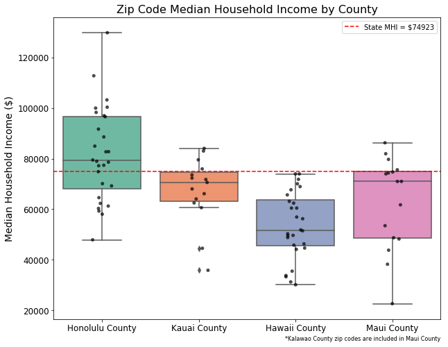
- There are vast wealth differences between the islands, with even the top earners of the Big Island making less than the state’s median household income.
- Maui and the Big Island have many areas that have similar wealth profiles.
- The “money-shot” figure:
Cleaning Data
Let's load in some census data. This is taken from the 5-Year 2017 American Community Survey via the Census Bureau.
df_data_1 = pd.read_csv(ACS_17_5YR_S1901_with_ann.csv)
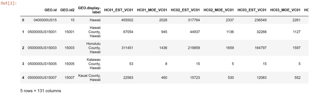
From the get-go, we have a lot of variables (131!) and a lot of confusing names (e.g. "HC01_MOE_VC01"?). Let's pull out just the data we want and rename them more sensibly.
##More sensible names
#First, mean household income...
df_data_1.rename(columns={"HC01_EST_VC13": "MHI"}, inplace = True)

#Next, households...
df_data_1.rename(columns={"HC01_EST_VC01": "Total Households"}, inplace = True)
df_data_1.rename(columns={"HC02_EST_VC01": "Family Households"}, inplace = True)
df_data_1.rename(columns={"HC04_EST_VC01": "Nonfamily Households"}, inplace = True)

#Now Geography data...
df_data_1.rename(columns={"GEO.id2": "GeoID"}, inplace = True)
df_data_1.rename(columns={"GEO.display-label": "GeoID Label"}, inplace = True)

##Making a simpler df
df_simple = df_data_1[['GeoID', 'GeoID Label', 'MHI', 'Total Households','Family Households','Nonfamily Households']]
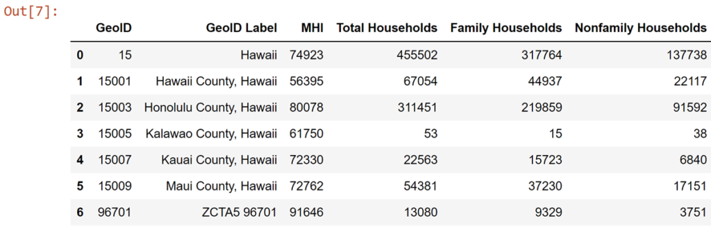
Great, that's more palatable. I pulled out MHI as a metric of socioeconomic status of our given communities. I also included household composition to get at some expedient metric reflecting community composition--i.e. what does that community actually 'look like' roughly, without biting off more than I could chew with fully exploring finer demographics (e.g. race, gender, etc.).
Now, let's take a quick look at whether our primary variable, MHI, has null data we should worry about?
df_simple[df_simple['MHI'] == '-']
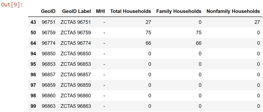
I don't want to replace those with 0--that would really skew summary statistics later on. Since the Census bureau deemed them too small to collect accurate data, I'm comfortable dropping them.
Now let's quickly make a "% of State..." column for MHI and household composition. That might be a easier way to gauge community 'kind' (e.g. a place with lots of families vs few) and wealth relative to the state average.
df_simple['% of State MHI'] = np.round_(np.divide(df_simple['MHI'], df_simple.loc[df_simple['GeoID'] == 15, 'MHI'].values[0]), decimals = 2)

df_simple['% Family Households'] = np.round_(np.divide(df_simple['Family Households'], df_simple['Total Households']), decimals = 2)
Ok, so the dataframe here is already a lot neater and easier to digest. But we still need to separate out the level of communities included here: State level data, from the County level, and Zip Code level. Let's make an individual dataframe for each, to make things a bit more organized still.
df_state = df_simple[df_simple['GeoID'] == 15]
df_state

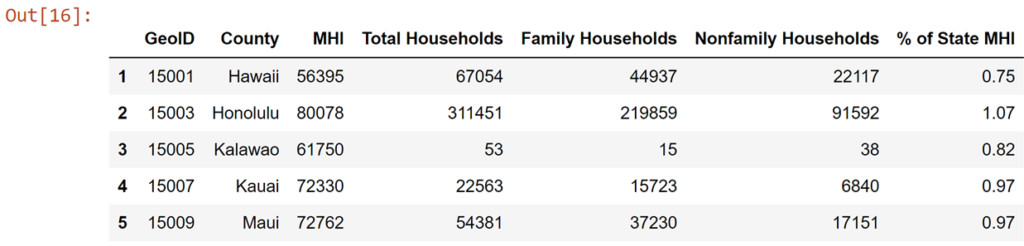
df_county = df_simple[df_simple['GeoID Label'].str.contains("County")]

new = df_county['GeoID Label'].str.split(" ", n = 1, expand = True)
df_county['County'] = new[0]
df_county.drop(columns = ['GeoID Label'], inplace = True)

#now to rearrange columns,
df_county = df_county[['GeoID', 'County', 'MHI', 'Total Households', 'Family Households', 'Nonfamily Households', '% of State MHI']]

df_county
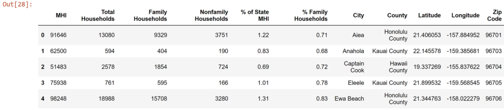
df_zip = df_simple[df_simple['GeoID Label'].str.contains("ZCTA5")]
df_zip
Analysis
Let's pull the features we want to analyze. Then, to make sure they are on a similar scale, let's standardize them too.
Features = ['MHI', 'Family Households', 'Nonfamily Households', 'Zip Code']
X = df_zip[Features].set_index('Zip Code')
X = np.nan_to_num(X)
X = preprocessing.StandardScaler().fit(X).transform(X)
Clustering I: K-Nearest Neighbors
K-Nearest Neighbbors, KNN, is a classic unsupervised clustering analysis in the data science toolkit. It cuts up our data into X amount of clusters, designates a center point for each cluster, then finds which data points are closer to their own cluster-center as opposed to another. If closer to another cluster-center, the data point is relabeled to be in that new cluster. That means that cluster-center might move a tiny bit, so then all of the distances to cluster-centers are checked again...and re-labeled if necessary...then checked again...until clusters stop changing.
To do it though, we first need an idea of how many "clusters" might be a good representation of the data. We don't want too few clusters (e.g. 2 might not tell us much) but too many might defeat the purpose of grouping them together (e.g. 20 might spread divide up our zip codes so much that it's practically like we didn't cluster at all). To find a decent number of clusters, let's run through the analysis with different clusters to see where things get too reductionist vs too disparate.
for clusters in range (1, 20):
    kmeans = KMeans(n_clusters = clusters, random_state = 0).fit(X)
    unique, counts = np.unique(kmeans.labels_, return_counts = True)
    print(dict(zip(unique, counts)))
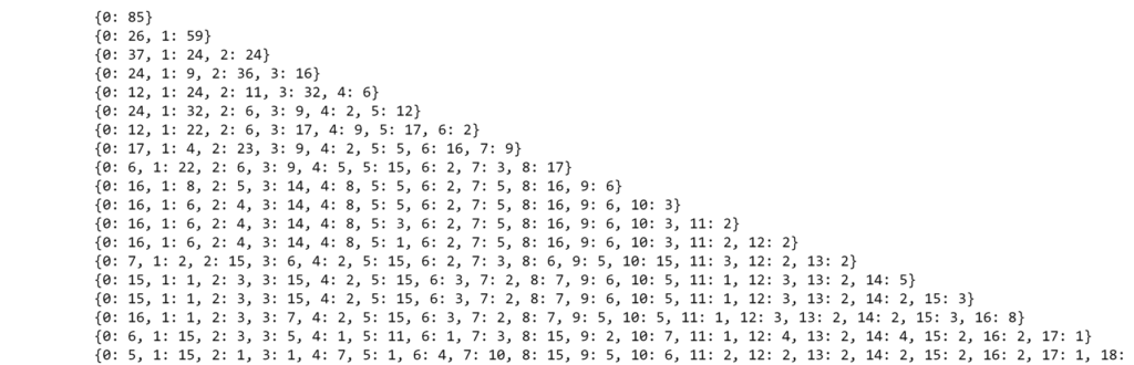
Let's stick with 8. Beyond that we start flirting with more, very small clusters. A few small clusters are fine, if that's the data it's the data, but too many small clusters starts to suggest to me that we're stretching to fit outliers too much.
Now we can insert the corresponding cluster labels (either 1 through 8) for each of our zip codes into our dataframe. Remember, this is unsupervised in the sense that we don't have a real a priori idea of how many groups we should be finding/seeing.
kclusters = 8
kmeans = KMeans(n_clusters = kclusters, random_state = 0).fit(X)

df_zip.insert(0, 'KNN Cluster', kmeans.labels_)
Clustering II: DBSCAN
Density-Based Spatial Clustering of Applications with Noise (DBSCAN) is another well-used, unsupervised clustering analysis in data science. This one relies on density of points to determine only what data is or is not "close" to each other and puts those into a cluster. Consequently, DBSCAN handles outliers a bit more elegantly than KNN because it doesn't force every point to necessarily be in a cluster--some outliers are just that, outliers.
There are two main parameters when doing a DBSCAN: how many points is considered a group? (i.e. our "minimum number of samples"); and how far apart is considered "dense" or not" (i.e. our "epsilon" value). To capture as many groups as possible--I'm thinking that if two zip codes are found to be similar, even that group still matters--I'll use 2 as our minimum. To find our epsilon, we need something a bit more complicated...
Let's make a basic KNN analysis of just 2 clusters, then see the distances.
rom sklearn.neighbors import NearestNeighbors
neigh = NearestNeighbors(n_neighbors = 2)
nbrs = neigh.fit(X)
distances, indices = nbrs.kneighbors(X)

distances = np.sort(distances, axis = 0)
distances = distances[:, 1]
plt.plot(distances)
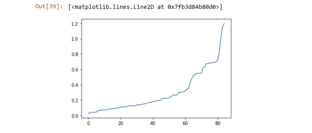
I'm interested in 0.6 on the y-axis. Ideally, we want to pick the place of maximum curvature. Considering those two big spikes, I think 0.6 seems like a decent compromise point.
Now let's run the DBSCAN with those parameters (Minimum = 2, Epsilon = 0.6) and add those label markers into our dataframe.
from sklearn.cluster import DBSCAN
import sklearn.utils
sklearn.utils.check_random_state(1000)
#Compute DBSCAN
db = DBSCAN(eps = 0.6, min_samples = 2).fit(X)
core_samples_mask = np.zeros_like(db.labels_, dtype = bool)
core_samples_mask[db.core_sample_indices_] = True
labels = db.labels_
realClusterNum=len(set(labels)) - (1 if -1 in labels else 0)
clusterNum = len(set(labels))
df_zip.insert(0, 'DBSCAN Cluster', db.labels_)
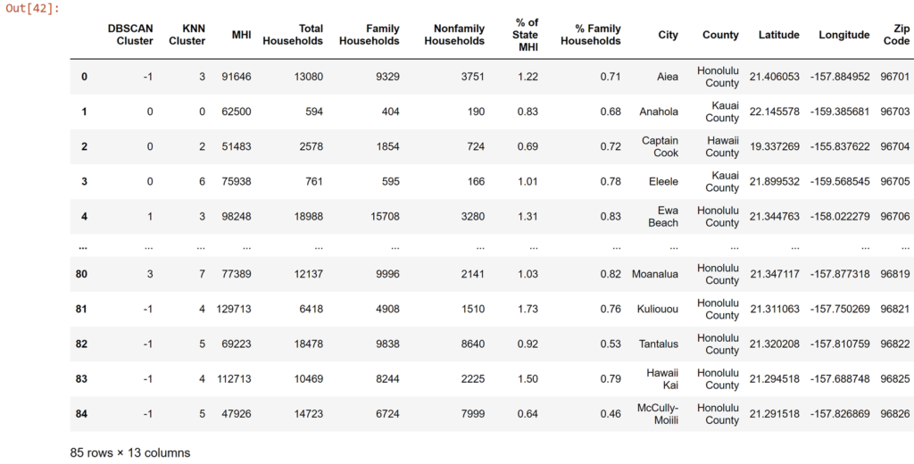
df_zip
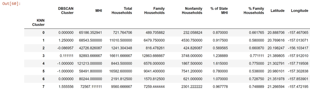
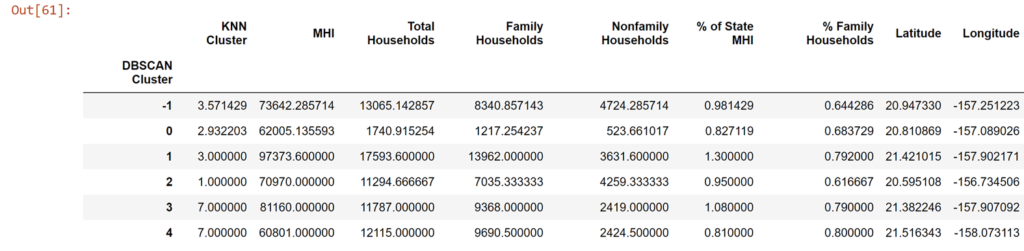
So what do these clusters mean? What does one cluster mean vs another? And how different are these two clustering methods?
Well, let's see:
df_zip.groupby(['KNN Cluster']).mean()
df_zip.groupby(['DBSCAN Cluster']).mean()
import scipy.stats

scipy.stats.pearsonr(df_zip['DBSCAN Cluster'], df_zip['KNN Cluster'])

So a minor correlation (r = 0.17) and, by classical statistical benchmarks, a non-significant result (p > 0.05). So we can't say the two clustering methods are unrelated. They have different ways of categorizing what is or is not similar so, while they are working off the same data, it's not obvious nor even required that they converge on the same way of describing the data. But broadly we can see what clusters are representing certain compositions of household types, household numbers, and median earnings.
Visualizing
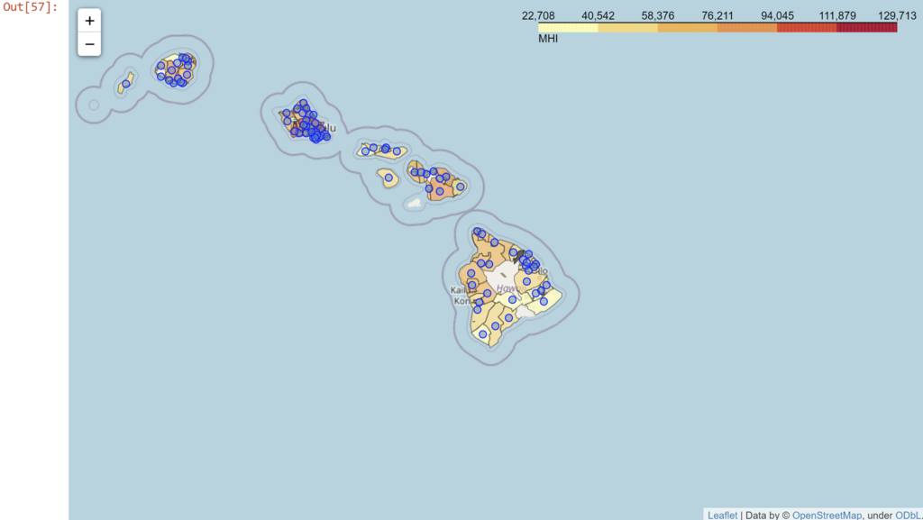
Now, let's see what these clusters look like on a map. To do that, I'm going to pull a geojson file from the Hawaii GIS Project to overlap onto a map. That way we can see more specific boundaries like counties and zip codes.
!pip install folium
import folium

#download the geojson file from Hawaii State's GIS Project site
!wget --quiet https://opendata.arcgis.com/datasets/cef8796083d34934bbea610a3d06c7c3_5.geojson

county_geo = r'cef8796083d34934bbea610a3d06c7c3_5.geojson'
First, lets see if this works!
#County Map
latitude = 19.8968
longitude = -155.5828
HIcounty_map = folium.Map(location=[latitude, longitude], zoom_start = 7)
HIcounty_map
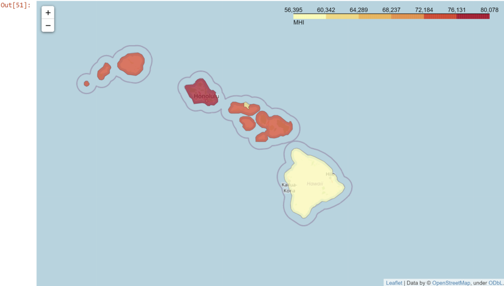
choropleth = folium.Choropleth(
geo_data = county_geo,
data = df_county,
columns = ['County', 'MHI'],
key_on = 'feature.properties.name',
fill_color = 'YlOrRd',
fill_opacity = 0.7,
line_opacity= 0.2,
legend_name = "MHI"
).add_to(HIcounty_map)
HIcounty_map
(if you want the full interactive maps, head to the Jupyter nbviewer render here)
Great, now let's try pointing out the zip codes. It might be too crazy to have the zip codes and counties overlaid, so let's just label the zip codes in each county boundary. And to be fancy, let's try to put a descriptive label for each zip code so we know something about each one.
#download the geojson file
!wget --quiet https://opendata.arcgis.com/datasets/ca2129be6a754ca3a255d438e82c6ae2_8.geojson

zip_geo = r'ca2129be6a754ca3a255d438e82c6ae2_8.geojson'

#Zip Code Map
latitude = 19.8968
longitude = -155.5828

HIzip_map = folium.Map(location=[latitude, longitude], zoom_start = 7)
HIzip_map

#plotting the boundaries
folium.Choropleth(
    geo_data = zip_geo,
    data = df_zip,
    columns = ['Zip Code', 'MHI'],
    key_on = 'feature.properties.zcta5ce10',
    fill_color = 'YlOrRd',
    fill_opacity = 0.6,
    line_opacity= .4,
    legend_name = "MHI",
).add_to(HIzip_map)

#Adding descriptive markers
for lat, lng, code, MHI, percent, county in zip(df_zip['Latitude'], df_zip['Longitude'],
                                                df_zip['Zip Code'], df_zip['MHI'], df_zip['% of State MHI'], df_zip['County']):
    label = '{},\n Zip Code: {},\n MHI: ${},\n % of State MHI: {}'.format(county, code, MHI, percent)
    label = folium.Tooltip(label)
    folium.CircleMarker(
        [lat, lng],
        radius=4,
        tooltip=label,
        color='blue',
        weight = 1,
        fill=True,
        fill_color='#3186cc',
        fill_opacity=0.5,
        parse_html=False).add_to(HIzip_map)

HIzip_map
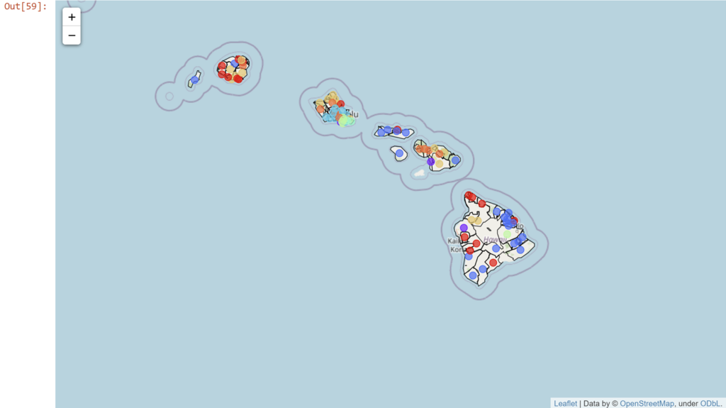
But what about those clusters? Let's see those KNN clusters first. We'll color each of the zip codes differently by cluster.
KNN_map = folium.Map(location=[latitude, longitude], zoom_start = 7)

import matplotlib.cm as cm
import matplotlib.colors as colors

#setting the color scheme for the clusters
x = np.arange(kclusters)
ys = [i + x + (i*x)**2 for i in range(kclusters)]
colors_array = cm.rainbow(np.linspace(0,1, len(ys)))
rainbow = [colors.rgb2hex(i) for i in colors_array]

#plotting Zip Code boundaries just like before, but removing the legened and fill-in colors
folium_del_legend(folium.Choropleth(
    geo_data = zip_geo,
    data = df_zip,
    columns = ['Zip Code', 'MHI'],
    key_on = 'feature.properties.zcta5ce10',
    fill_color = 'YlOrRd',
    fill_opacity = 0,
    line_opacity= .8,
)).add_to(KNN_map)

#adding sticky markers to the map
markers_colors = []
for lat, lon, code, cluster in zip(df_zip['Latitude'], df_zip['Longitude'], df_zip['Zip Code'], df_zip['KNN Cluster']):
    label = 'Zip Code: {}, \n Cluster: {}'.format(code, cluster)
    label = folium.Popup(label)
    folium.CircleMarker(
        [lat, lon],
        radius=5,
        popup=label,
        color=rainbow[cluster-1],
        weight = 1,
        fill=True,
        fill_color=rainbow[cluster-1],
        fill_opacity=0.7).add_to(KNN_map)

KNN_map
How about the DBSCAN?
DB_map = folium.Map(location=[latitude, longitude], zoom_start = 7)

import matplotlib.cm as cm
import matplotlib.colors as colors

#setting the color scheme for the clusters
x = np.arange(clusterNum)
ys = [i + x + (i*x)**2 for i in range(clusterNum)]
colors_array = cm.rainbow(np.linspace(0,1, len(ys)))
rainbow = [colors.rgb2hex(i) for i in colors_array]

#plotting Zip Code boundaries just like before, but removing the legend and fill-in colors
folium_del_legend(folium.Choropleth(
    geo_data = zip_geo,
    data = df_zip,
    columns = ['Zip Code', 'MHI'],
    key_on = 'feature.properties.zcta5ce10',
    fill_color = 'YlOrRd',
    fill_opacity = 0,
    line_opacity= .8,
)).add_to(DB_map)

#adding sticky markers to the map
markers_colors = []
for lat, lon, code, cluster in zip(df_zip['Latitude'], df_zip['Longitude'], df_zip['Zip Code'], df_zip['DBSCAN Cluster']):
    label = 'Zip Code: {}, \n Cluster: {}'.format(code, cluster)
    label = folium.Popup(label)
    folium.CircleMarker(
        [lat, lon],
        radius=4,
        popup=label,
        color=rainbow[cluster-1],
        weight = 1,
        fill=True,
        fill_color=rainbow[cluster-1],
        fill_opacity=0.7).add_to(DB_map)

DB_map
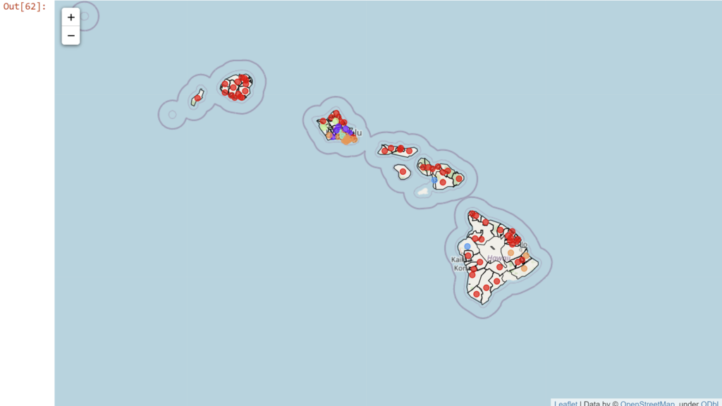
Now those clusters may be all well and good, but they are pointing at some big differences between different places across the islands. E.g. the Big Island looks a lot different from Oahu, indeed Oahu looks rather different from all of the other islands. Let's see all of the islands compared to each other in a single figure.
import matplotlib.pyplot as plt
import seaborn as sns
%matplotlib inline

#Setting the stage
plt.figure(figsize = (10,8))

#Boxplot print
ax = sns.boxplot(x ='County', y = 'MHI',
                 data = df_zip,
                 palette="Set2",
                 saturation = 0.8)

#Adding zip code data points
#ax = sns.swarmplot(x = 'County', y = 'MHI', data = df_zip,color = "black", alpha = .7)
ax = sns.stripplot(x = 'County', y = 'MHI',
                   data = df_zip,
                   jitter = True,
                   color = 'black',
                   alpha = 0.7)

#State MHI Line
ax.axhline(df_state.loc[df_state['GeoID'] == 15, 'MHI'][0],
           ls = '--',
           label = 'State MHI = ${}'.format(int(df_state.loc[df_state['GeoID'] == 15, 'MHI'][0])),
           color = 'Red')

#Figure Details
ax.legend()
ax.set_title("Zip Code Median Household Income by County",fontsize = 16)
ax.set_xlabel("*Kalawao County zip codes are included in Maui County",
              position = (1, 0), horizontalalignment = 'right', fontsize = 8)
ax.set_ylabel("Median Household Income ($)", fontsize = 14)
ax.tick_params(labelsize = 12)
Take-Aways
We can clearly see that wealth differs across the islands. From our clustering, we can see that there different, valid ways to group communities. There are "certain kinds" of communities that we can think about for one reason or another (i.e. how much money most residents earn, how many families vs single occupants live there). For example, KNN Cluster 4 broadly captures the relatively few very affluent, family households, while KNN Cluster 5 shows the larger group of poorer, single households.
And from our maps, we can see that not all areas of a single island are necessarily similar to each other too. Considering that poorer communities are the ones more likely to currently have cesspools, thus needing updates, it is crucially important to consider those financial vulnerabilities when making planning decisions. Asking communities to frontload some costs of the infrastructure projects, for example, may differentially stress some places far more than others--both between islands and within them. That suggests that any comprehensive infrastructure plan must involve robust interchange between the State-level and County-level to equitably distribute costs.